In your UI UX Design, If you are using pure black, i.e., #000000, in your design, then be aware that you might be affecting the whole eye.
Wait, what? You might be thinking, that this is another useless theory from some random blog post.
But no! It’s a scientifically proven fact, my friends. Let me show you some examples:
Never use “PURE BLACK” color in typography. Check out the two screens we have here below.

- On the left side, the text is written in pure black, i.e., #000000, and on the right side, #212427 is used for font color.
As a normal reader, are you more comfortable reading the right or the left ?
Take a closer look,
Why does the left one look more striking?
While,
The other one (the right one) looks more comfortable to read, right?
The left text is Pure Black with code #000000, while the right text is Dark Gray with code #212427.
Why does color affect reading comfortability? (UI UX Design Tips)
There are several biological effects after using these colors for a longer period of time.
This one is the most concerning of them all.
Eye Strain Problem
Using pure black with code #000000 can cause several problems, one of the problems is eye strain for readers. Because,
White with code #FFFFFF has more striking brightness compared to pure black with code #000000.
The brightness polarity requires the eye to work harder to read pure black text on a white background.
The real example is when we turn on the phone in a dark room (and fall on the face, hehe).
The drastic difference between a dark room light and a very bright phone light requires the eyes to work harder than usual.
What can we do to solve this issue ?
We can do many things to save our eyes if you ask me frankly. but for starters, let’s just start from smaller things like,
Approach to Decrease Eye Strain by avoiding Pure Black Color
Yes, we need to avoid pure black because of eye strain issues (contrast).
So we chose dark grey to replace pure black. Then we need to answer the next question:
“How do we choose the right dark gray?”
That’s a valid question, if you ask me. Obviously, one cannot just follow the random use of grey colors.
There has to be some scientific proof for that too, right? As humans, we are curious creators; we need proof of everything before we adopt it in our daily lives.
Ok! Look at this image below, which has two rows of color palettes.
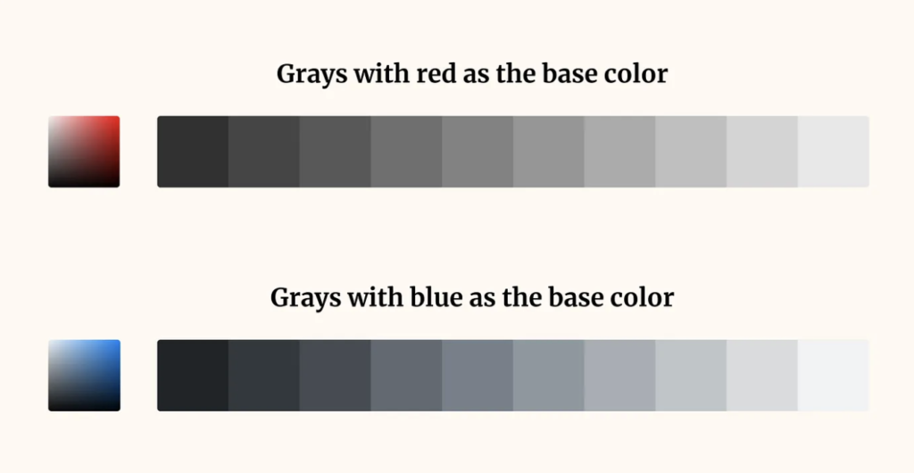
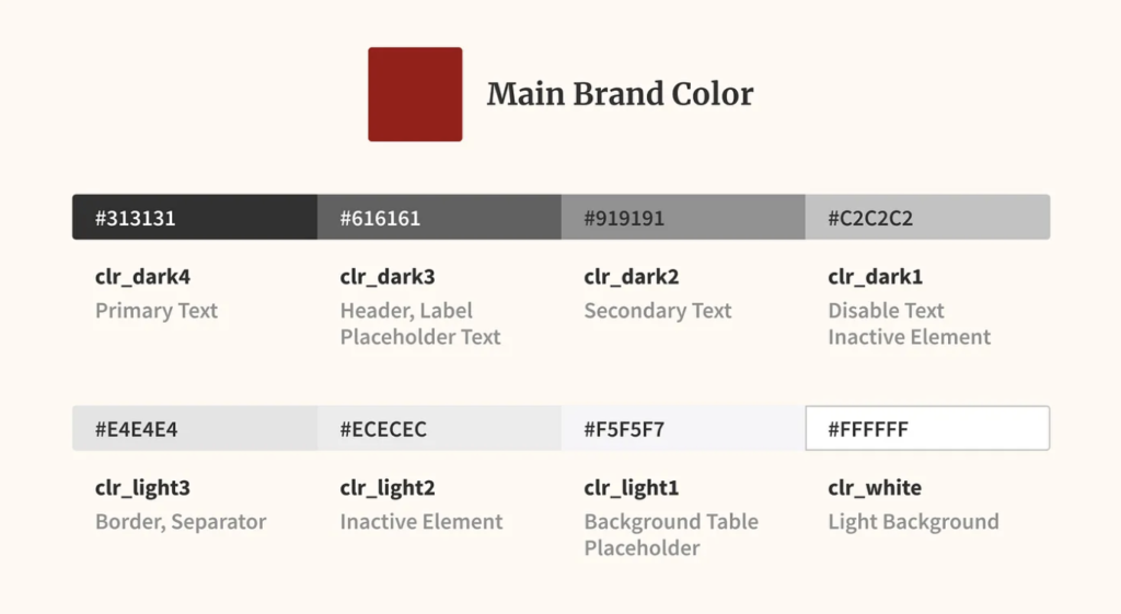
To determine the dark grey composition, several experiments have been conducted by choosing the base Colors, red and blue.
Because at the time of the experiment, the client had red as the base color, it was then decided to use dark grey with red as the base color.
So the color is still consistent with the main brand color.
What do we learn here today ?
After all the above explanation with facts and experiments, its clear that for a Better Readability and for a Better Conversion, Black and white are the basic colors that are often used.
As a designer, we need to pay attention to the balance of contrast between text and background color so that it is safe for the user’s eyes.
Because reading discomfort could break your product, especially if you are content dense apps that rely heavily on reading.
Reducing pain due to eye strain means users can spend more time reading and enjoying the contents.
So indirectly, we can improve the conversion rate on your apps.
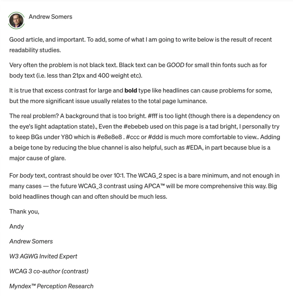
Like Andrew Somers once said:
Conclusion
In short, just use
#212427 for Black, and
#F5F5F7 for White.
That’s it.
Also Read: How to Publish your own book on kindle !
Extra: These are some of the links were you can check out more information regarding the same topic.